Work Flow
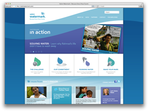
Xylem Watermark
 I completely redeveloped and applied a new design to the Xylem Watermark site as an employee of VisionMix. Xylem Watermark needed a site that they could update regularly and easily, along with blogs from the company leaders and trip journals from employees and volunteers, so I chose WordPress as the base for the site. In order to create a custom tailored experience, I designed and developed multiple custom plugins. I also implemented jQuery animations and controls to enhance the user experience.
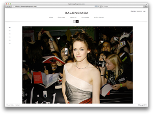
Balenciaga Fragrance
 I assisted in the redevelopment of Balenciaga Fragrance as an employee of VisionMix. The site is built in drupal and utilizes jQuery to dynamically resize images, toggle between different viewing modes, build clean waypoint based navigation, and seamlessly integrate social media sharing.
Celine Dion Beauty
 I rebuilt and updated the Celine Dion Beauty site from the old Flash to a completely HTML and jQuery based site. The functionality and animations in the Flash site needed to be preserved, while adding mobile accessibility, increased load times, and easier updating. This project was completed by contract for VisionMix.
Paul Wilmot’s Blog
 Paul Wilmot’s blog embodies the refined fashion and sensibility that is at the core of his business and life philosophy. The site focuses on his words, accented with image highlights and social media integration. Some custom coding allows for him to easily select a compelling image for each post and then dynamically creates a thumbnail of the image to be displayed on the home page.
Fleishman-Hillard Sustainability
 The Sustainability site afforded an opportunity to break from our standard micro-site template to offer a more specialized design. The practice group requested that the site focus on the corporate benefits of sustainability which influenced the clean minimalist look. The site still maintains a “green” feel, but avoids cliché stock imagery by relying on text and illustration.
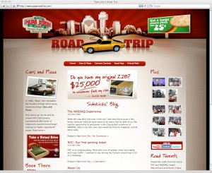
Papa John’s Road Trip
 The Papa John’s Road Trip site pushes the limits of WordPress post filtering by breaking every piece of the site into city categories. Although it was later removed due to changes in the client’s plans, the site included a dynamically generated map that displayed past and upcoming cities with events and city highlights.
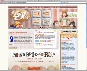
Mom’s Dinner Helper
 The Mom’s Dinner Helper site drastically bends the WordPress framework, turning the blogging/CMS platform into a recipe catalogue with user submissions, community features, and promotional point tracking to encourage participation. Several custom plugins were built to seamlessly integrate these features into the user interface. Some feature highlights include recipe submission, categorization, photo uploads, and recipe rating. Several admin pages allow the site moderators to approve recipes and track the redemption of points for prizes.
Fleishman-Hillard

The redesign of Fleishman-Hillard’s site culminates the work that my team and I have accomplished over the past two years. The drive of the design establishes the agency as a force in the growing digital arena through the airy visual elements, a plethora of dynamically aggregated content, and a restructuring of how we present our work and the people behind it.
Mobile Behavior
 The Mobile Behavior site went through multiple rounds of customized features that once included dynamic case studies and news items. The final iteration boasts a dynamic project gallery preview, custom AJAX bios, and various news feeds.
AT&T Calm, Cool, Connected Blog

The Calm, Cool, and Connected blog represents a significant departure from the old site. The goal of the redesign was to not only give the blog a fresher and more current look, but also to integrate social media channels, such as Twitter, Flickr, and Youtube.
